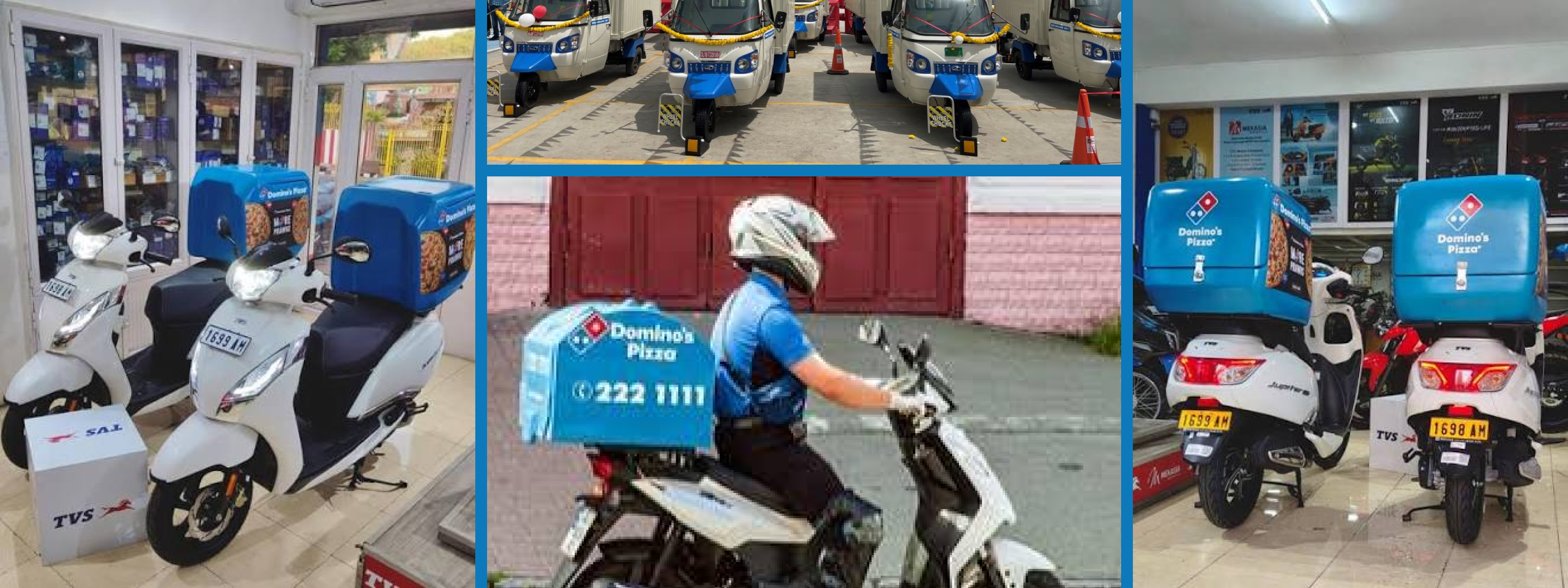
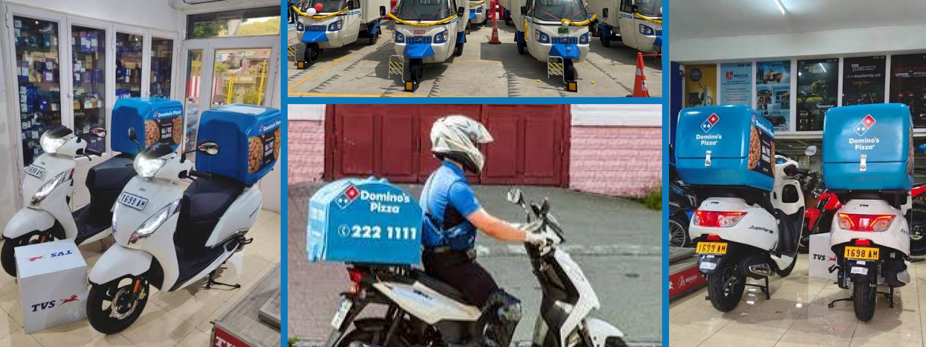
Turning EV fleet data into operational decisions, a connected fleet management platform designed for enterprise operators running hundreds of commercial EVs.
TVS was entering a rapidly growing commercial EV market where businesses were buying vehicles in large numbers for delivery and mobility operations. But the opportunity wasn't as simple as selling more vehicles. Once a customer put hundreds of EVs on the road, a much harder operational problem appeared: keeping those vehicles productive, charged, healthy and available every day.
At the time, we were working with different kinds of B2B customers, each bringing a different fleet size, business model and set of requirements. We were effectively chasing and cracking individual deals, then adapting the solution around whatever that particular customer needed. It worked for winning business, but it was difficult to scale into a repeatable product.
The bigger opportunity was to move from selling EVs to helping customers operate them. If TVS already understood the vehicle, its battery, telematics, service ecosystem and charging behaviour, we had a unique advantage: we could connect the physical vehicle to the digital operations around it.
That became the foundation for the B2B Connected Solutions initiative, building a product ecosystem that could help fleet operators monitor, understand and improve their operations instead of giving every customer another bespoke dashboard.
For an enterprise fleet operator, an EV is not just a vehicle. It is an operational asset that has to earn its place on the road every day.
Fleet managers needed to know which vehicles were available, which were being under-utilised, which riders were creating safety risks, which batteries were being charged incorrectly, which vehicles needed service, and whether the fleet was actually performing better than the previous week.
The problem was that these answers lived across different systems, teams and workflows. Vehicle telematics could tell you where an asset was. Charging data could tell you when it was plugged in. Service systems could tell you about repairs. Rider systems could tell you about attendance and behaviour. But the fleet manager still had to connect the dots.
That created a fundamental product opportunity: don't make operators monitor more data. Help them make better operational decisions.
The product therefore had to work at two levels, a high-level business view for understanding the health of the fleet, and deeper operational views for investigating vehicles, riders, trips, charging and service issues.
The first step was deliberately broader than interface design. We mapped the commercial mobility landscape, studied different fleet operating models, identified stakeholders, mapped customer journeys and looked at the existing competitive landscape.
The research revealed that "fleet operator" was not a single persona. A captive fleet such as Domino's has its own demand and uses vehicles primarily to serve its own operations. A New Age 3PL such as MoEVing or Magenta operates a large fleet for multiple organised clients. Traditional 3PLs operate smaller fleets with lower technology maturity. BYOV operators have a completely different relationship with the vehicle.
The stakeholders were equally diverse: fleet managers, service managers, riders, vehicle owners, financiers, demand generators and TVS administrators. Each one looked at the same physical vehicle through a different business lens.
This changed the design question completely. We weren't designing one dashboard for one persona. We were designing a connected product ecosystem where the same underlying vehicle data could become different experiences depending on who needed it and what they were trying to accomplish.


The product strategy started with understanding who was actually buying, operating and depending on the fleet.
The biggest strategic decision was deciding who the product should serve first.
Instead of treating every potential customer as equally important, we evaluated segments across unmet need, buying potential, ability to pay, business impact, demand density, competition, EV penetration and long-term revenue opportunity.
Captive fleets and New Age 3PLs emerged as the strongest initial opportunity. They had large fleets, more structured operations and a stronger need for technology that could improve fleet productivity. Traditional 3PLs and BYOV remained important, but their needs and willingness to pay made them less suitable as the starting point.
This gave the team something we did not have before: a product direction. We could stop reacting to individual feature requests and start building capabilities that solved recurring problems across a commercially valuable customer segment.

We used business opportunity, customer impact and willingness to pay to decide where the product should win first.
Once the customer segments were clear, we translated the customer journeys into a large feature universe. The consolidated list contained 166 potential features across Business, Charging, Delivery, Rider, Safety, Service and Trip assistants.
The challenge was no longer "What can we build?" It was "What does the operator actually need to accomplish?"
Five jobs became particularly important for the first version of the fleet experience: ensure daily fleet safety, ensure fleet productivity, resolve vehicle issues, resolve minor issues and maintain vehicle health.
This reframing helped us separate the product's underlying capabilities from the experience we needed to create. A feature such as vehicle health alerts was not valuable because an alert existed. It was valuable because it helped an operator detect a problem early enough to protect uptime.
That distinction became the foundation for prioritisation: every capability had to earn its place by contributing to an important operational outcome.


The exercise was less about adding features and more about deciding which customer outcomes deserved product investment.
A fleet manager rarely opens a dashboard thinking, "I want to see a donut chart."
They open it with a question.
How many vehicles are available today? Which vehicles are under-utilised? Why is range dropping? Which riders need attention? Are we charging efficiently? What is causing downtime? Where is the fleet performing well, and where is money being lost?
So we inverted the conventional dashboard model.
Instead of presenting a collection of metrics and asking operators to interpret them, the experience starts with the answer and lets them drill into the evidence.
A fleet utilisation card doesn't simply show a graph. It tells the operator how much of the fleet was utilised, whether that changed from the previous period and what that means. A charging card doesn't just show charging sessions. It helps identify unhealthy charging behaviour and its potential operational impact.
The result is a hierarchy of information: insight first, evidence second, action third.
The dashboard was designed as the entry point into a much larger connected ecosystem.
At the fleet level, operators could understand utilisation, cost and overall performance. From there, they could move into vehicle-level health and uptime, rider performance and safety, trip economics, charging behaviour and service operations.
This structure mattered because fleet problems are rarely isolated. A vehicle may have poor range because of charging behaviour. A rider may have low productivity because of excessive idle time. A trip may become loss-making because of route or vehicle allocation. A service issue may become a business issue when it takes a vehicle off the road during peak demand.
The interface therefore needed to preserve the relationship between these layers rather than treating each dashboard as a separate destination.


A weekly fleet report translated raw vehicle data into business-level insights across cost, utilisation, charging, driving behaviour and fleet performance.
The Domino's use case was a useful test of the product philosophy because the customer wasn't asking for more telemetry. They needed to understand whether their fleet was working efficiently.
The report brought together distance and operating cost, charging time and range, fleet utilisation, peak utilisation periods, running versus idle time, charging behaviour, driving modes and negative braking.
More importantly, the metrics were contextualised. Instead of simply saying that 65% of the fleet was utilised, the report explained that 35% of capacity was unused. Instead of showing charging time as an isolated number, it compared performance with the previous period. Instead of showing driving behaviour, it connected Power Mode and negative braking to operational implications.
That turned a collection of vehicle signals into something a fleet manager could discuss with an operations team.
1. Insight before information. We prioritised the answer over the chart. Operators could start with an insight and drill into the underlying data instead of interpreting every visualisation themselves.
2. One platform, different defaults. Fleet managers, service managers and other stakeholders needed different information, but creating completely separate products would fragment the experience. Role-based defaults allowed us to personalise the starting point without fragmenting the underlying system.
3. Dense, but not chaotic. B2B operations users spend long periods inside their tools and often need to compare several variables at once. We deliberately allowed higher information density than a consumer product, using hierarchy, spacing and typography to keep the experience scannable.
4. Connect the insight to the action. Monitoring alone does not improve fleet performance. If a dashboard identifies a vehicle that needs attention, the next step should be close at hand: service, communication, escalation, charging intervention or another operational action.
The common thread across all four decisions was simple: the product should reduce the distance between knowing something and doing something about it.
The first year generated ₹3 Cr in revenue, with ₹50L coming from the Domino's fleet use case, ₹1.5 Cr from 3PL clients including MoEVing, Magenta and Fyn Mobility, and another ₹1 Cr from other delivery models.
More importantly, the work changed the nature of the opportunity. We were no longer only responding to individual fleet requirements. We had a clearer product model, defined customer segments, a prioritised feature roadmap and a connected architecture that could support multiple commercial mobility use cases.
The product strategy also opened up recurring revenue opportunities around fleet operations, vehicle maintenance, vehicle-data APIs and premium connected services. That shifted the role of UX from designing a dashboard to helping define how TVS could create value throughout the lifecycle of a commercial EV.
The projected YoY growth of ₹5 Cr reflected the opportunity to scale this model beyond the initial customers and use cases.
The most important thing I learned from this project was that B2B product design often starts before the interface.
When the team is chasing different customers with different requirements, it is tempting to solve every request individually. But that creates a product that reflects the sales pipeline rather than a coherent understanding of the market.
The biggest design contribution I could make was therefore not a particular screen. It was helping create a common language between business opportunity, customer problems, product capabilities and interface decisions.
A fleet dashboard is only useful when the organisation knows why those metrics matter, who needs them, what action they should trigger and how the underlying systems can support that action.
That changed how I think about product design. Especially in B2B, the designer's job is not simply to make complexity easier to look at. It is to decide which complexity deserves to exist in the first place.
TVS gave me the opportunity to work at that level: moving from individual screens to product strategy, from user requirements to business models, and from vehicle telemetry to a connected mobility experience.
"Don't build a dashboard that tells operators everything. Build a product that helps them know what matters, and what to do next."